"Time itself, through the mechanism of causality, imparts structure into a time series." —Applied Bayesian Forecasting and Time Series Analysis
Time series have a temporal structure, which makes them unique from other data. Their observations are recorded sequentially, and time passing imparts structure across the data. Each observation reflects the world at its time. But time keeps passing, and the world keeps changing. So, observations closer in time tend to be more similar than those farther apart.
This relationship can be measured and incorporated into modeling a time series. Enter the autocorrelation function (ACF), which measures that similarity at different distances called lags.
$$ \rho_k = \frac{\sum_{t=k+1}^{T} (y_{t-k} - \bar{y})(y_t - \bar{y})}{\sum_{t=1}^{T} (y_t - \bar{y})^2} $$
\(\rho\), linear correlation between the lagged time series (\(k\)) and the original time series
\(k\), number of lags
\(t\), time index
\(T\), number of observations in the time series, the max value of \(t\)
\(y\), observation at time \(t\)
\(\bar{y}\), mean of all \(y\)s
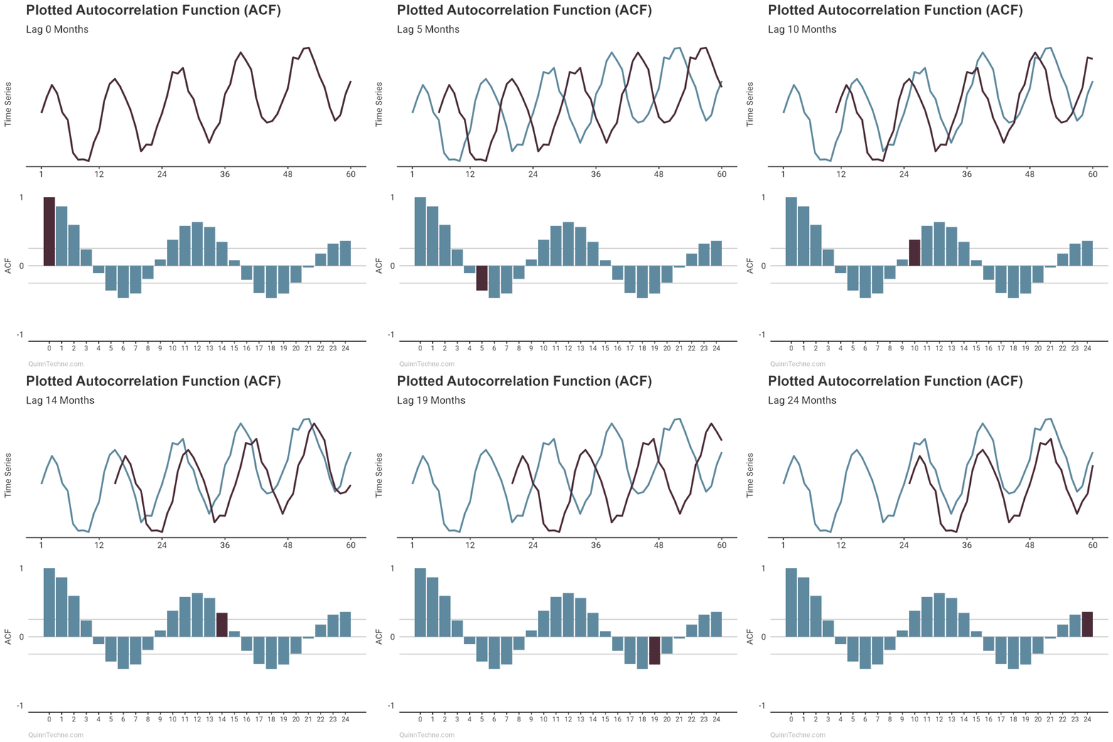
The ACF calculates a value between -1 and +1, where values closer to 1 have a strong linear correlation and values closer to 0 have little. Imagine you have a plotted time series. You also have a copy of that plot overlayed so you can slide it left and right on top of the original. (Remember overhead transparencies?) When the overlay and original plot line up, you get an ACF result closer to 1.

The intuition is that the numerator is larger when the lagged and original time series match up. The noticeable points you would visually align are the same points that make \((y_t - \bar{y})\) larger in magnitude, increasing the numerator and increasing the ACF result.
For R, you can use the included acf() function to get a nice plot. For Excel, there's no native ACF function. However, you can get the values using this =LAMBDA()formula I wrote (I like to add Lambda formulas to the Name Manager Formulas > Name Manager > New...): =LAMBDA(observations, lag, SUMPRODUCT(TAKE((observations - AVERAGE(observations)), + ROWS(observations) - lag), TAKE((observations - AVERAGE(observations)), - ROWS(observations) + lag)) / DEVSQ(observations))
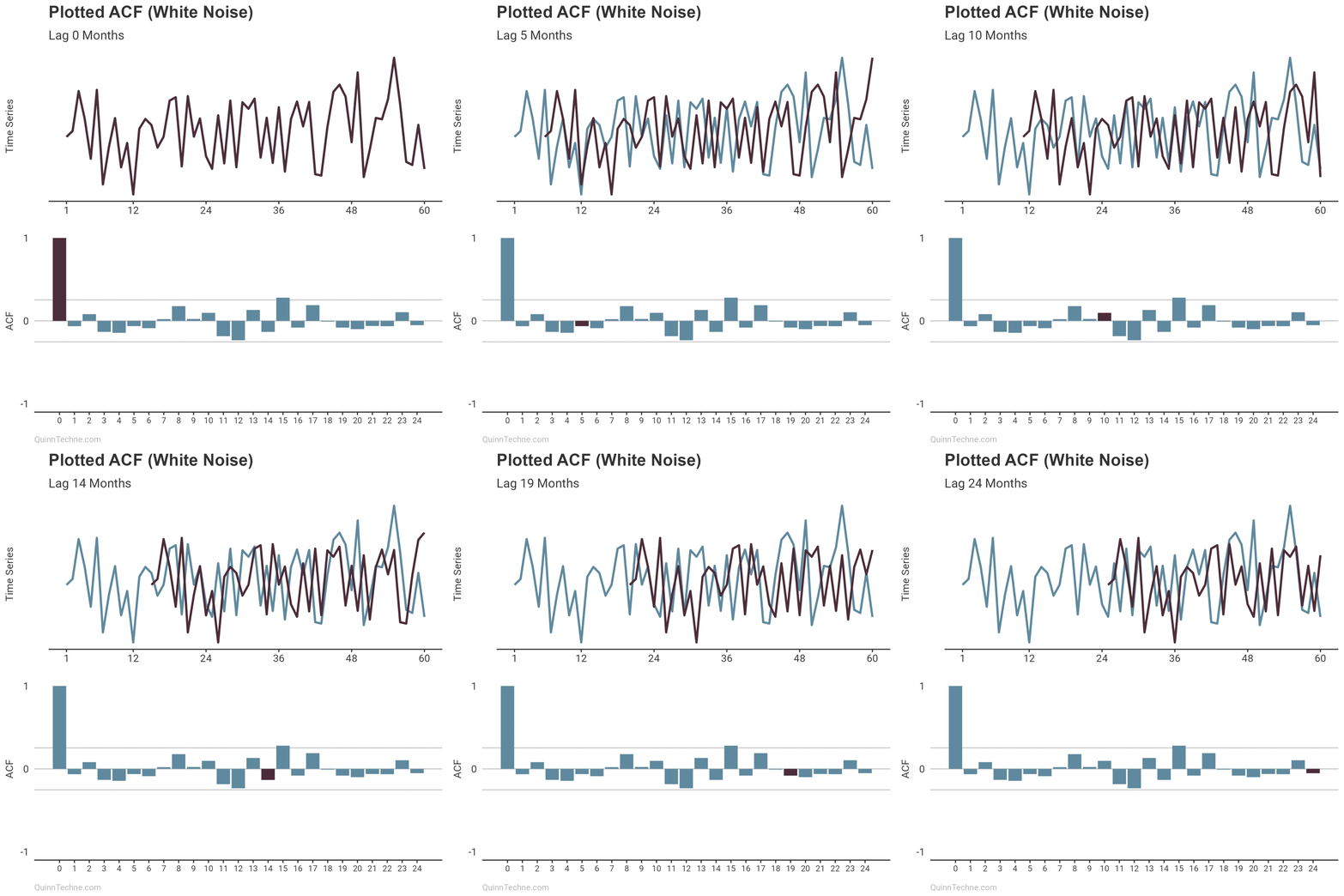
Higher ACF results are typically spotted by plotting an interval like the gray horizontal lines in the example plots:
$$ \text{ACF Confidence Interval} = 0 \pm 1.96 \times \sqrt{\frac{1}{T}} $$
The ±1.96 corresponds to a 95% confidence interval. You can change that value depending on the context of your analysis.

If the plotted ACF results bounce around zero for all lags (prior plot), your time series has little temporal structure and is likely white noise. Moreover, white noise is desirable if looking at model residuals because it means your model has handled any autocorrelation.
Otherwise, if the plotted ACF results show noticeably high correlations at some lags, then congratulations! You can use that information to appreciate the anatomy of your time series and choose a statistical model.
For time series models, consider Holt-Winters (exponential triple smoothing or ETS in Excel), autoregressive integrated moving average (ARIMA), or a dynamic linear model (DLM, state-space model, or Bayesian structural time series).
Hyndman, R.J. & Athanasopoulos, G. (2021). Forecasting: Principles and Practice, 3rd Edition. Otexts. https://otexts.com/fpp3/
Pole, A., West, M., & Harrison, J. (1994). Applied Bayesian Forecasting and Time Series Analysis. Chapman and Hall/CRC.
This website reflects the author's personal exploration of ideas and methods. The views expressed are solely their own and may not represent the policies or practices of any affiliated organizations, employers, or clients. Different perspectives, goals, or constraints within teams or organizations can lead to varying appropriate methods. The information provided is for general informational purposes only and should not be construed as legal, actuarial, or professional advice.

