Putting Some Science Back Into Actuarial Science
The degree is called Actuarial Science. However, part of the science is lost due to poor design when communicating results.
Most actuaries, statisticians, and data scientists will select, use, and review their data and models skillfully and carefully. It's an outcome of intuition, training, and workflows. Yet, those things extend less often to the design of communicating results.
For actuaries, the communication standard is to "identify the methods, procedures, assumptions, and data used by the actuary with sufficient clarity that another actuary qualified in the same practice area could make an objective appraisal of the reasonableness of the actuary's work." per Actuarial Standards of Practice, No. 41 — Actuarial Communications.
The scientific rigor in actuarial work comes from the ability to appraise and critique each other's work. That's great, but we should consider a broader scope than this standard: First, only some who review the results are qualified actuaries. Two, and more importantly, "sufficient clarity" doesn't always translate to enough context for meaningful vetting, particularly when results are only a table of point estimates—usually the average result of the analysis.
Poor design frustrates an accessible representation of the data, models, and results. Here are some better design choices to consider.
Distributions as Context
There's a common industry joke, "Hey, did you hear about the statistician that drowned in a river that was, on average, six inches deep?" (Actuaries have a license to be macabre.) This statistician's fateful error was ignoring the river's distribution—the average depth and how much that depth varies.
Most actuaries are modeling forecasts, like prospective insurance premiums or enrollment levels. Forecasts are inherently probabilistic statements that quantify our uncertainty given the data, model, and assumptions. The results are distributions!
Unfortunately, instead of showing a distribution, actuaries or other types of data analysts commonly communicate only a table of point estimates 6 inches deep. And 6.39 inches deep because the model said 6.3854291. We're fooling ourselves.
Intervals instead of point estimates can be a communication improvement, but they still risk oversimplifying the uncertainty. Suppose there's an indicator variable in the model, and I tell you the result is -1 to 34. First, you might wonder what the basis of that interval is (distribution, confidence level). Second, anyone trained in frequentist methods, such as confidence intervals and p-values, might quickly check where zero falls. Suddenly, an attempt to convey volatility is reduced again to a binary outcome that is statistically significant or not. Intervals are fine but need support.
Beyond Point Estimates
The better option, then, is to show the entire distribution. Visuals will help greatly. But, sometimes you are constrained to text, and a well-documented interval will be better than a point estimate. However, if you can do so, consider these ways of communicating the result distribution:
First, here are three mock data sets. The upcoming tables show a common setup: starting data, calculated factor, result.
# Generated Data
red <-    rnorm(sim, mean = 20, sd = 5)
blue <-   rnorm(sim, mean = 25, sd = 15)
green <- rlnorm(sim, meanlog = 2.5, sdlog = 0.8) - 25
Tables
Consider their output as only point estimates; start gasping for air.

Now, here are some interval options. The first is to show a range with an en dash (–) slightly longer than a hyphen (-). It fits in one cell but omits the center of the distribution. The distribution may need to be clarified if it is asymmetrical. You also should specify what the range is based on (X% confidence interval or credible interval—depending on your stats religion). Sometimes, the dash gets confused with minus signs.

Switching to the plus and minus (±) approach, you can capture the center of the distribution. I've also dropped numbers after the decimal to make grasping the values easier. Context may dictate how many decimal places to show. But you are implying your distribution is symmetrical with equal distance from your center.

Depending on your audience, you can try different spread statistics. The first example table has an interval built from standard deviations, like a confidence interval. In this second table, I show the spread as the Mean Absolute Deviation, which might have a magnitude more intuitive for a non-statistical audience.
Last, showing percentiles communicates the width and the center, and you can tell if there's asymmetry. You can also customize the number of decimal places for a consistent format across columns.

The content of your communication and the needs of your audience will determine how many items your table should display as ranges. Tables are often limited to paper width, and trying to understand multiple ranges simultaneously can be mentally taxing. For one table, use ranges for key factors or results. Otherwise, use multiple tables or plot the ranges like in the upcoming examples.
Plots
Text is a start, and here are three ways to display the same distributions to greater effect.
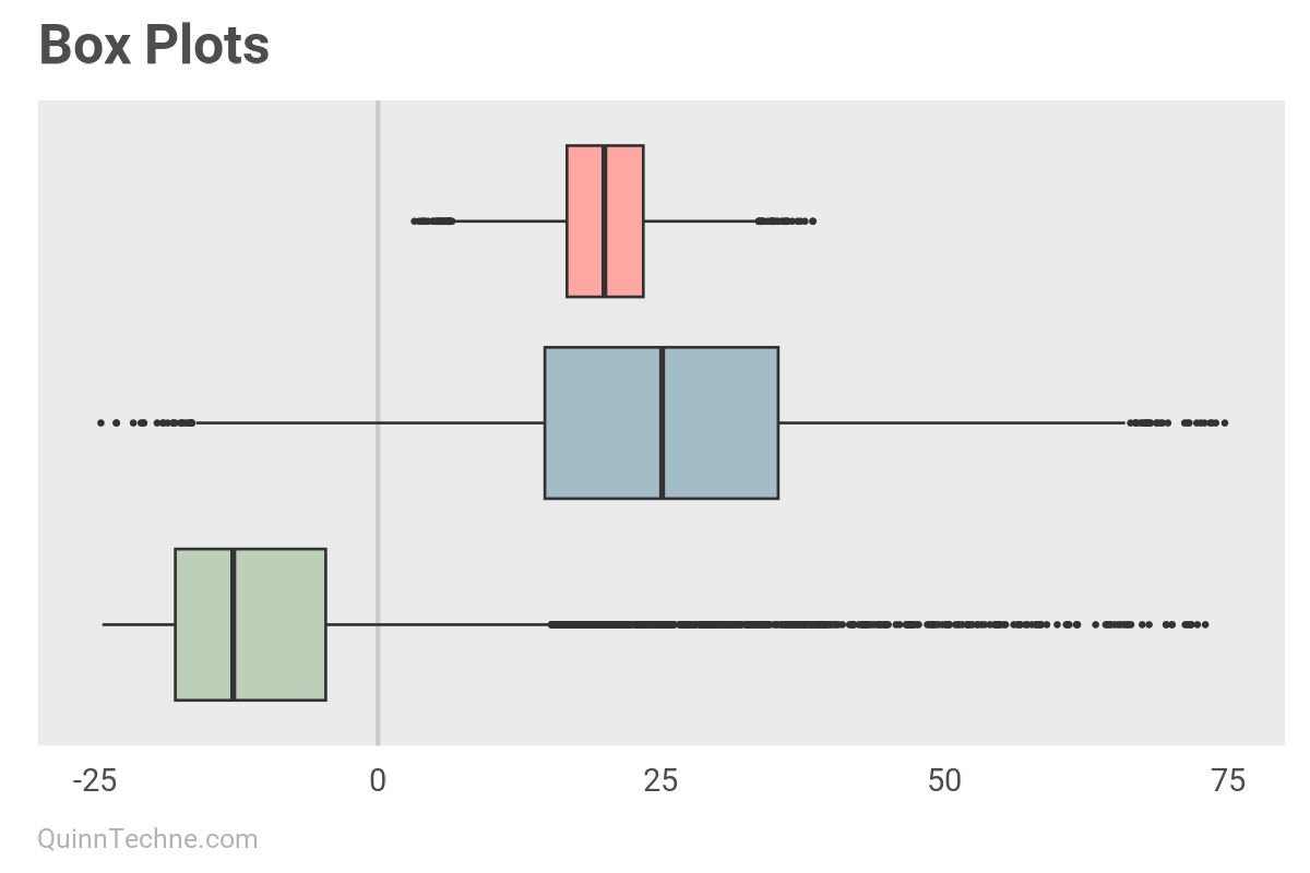
The first is a Box Plot, which you can make in R with ggplot using geom_boxplot() or in Excel with the native statistical chart option "Box & Whisker" plot. Having quartiles marked is nice, with the main box being the 50% of the distribution between the 25th and 75th percentile, called the interquartile range (IQR). Box plots mark outliers with dots on the outside of the lines. Characterizing data points as outliers can give legitimate data points a bad reputation. It's not their fault they're outliers.

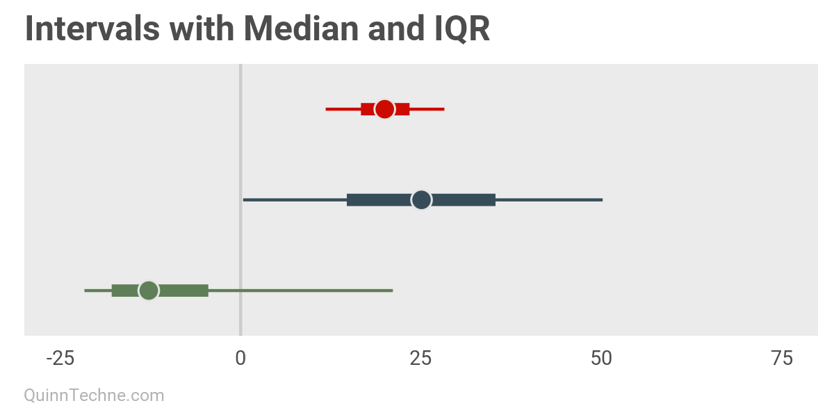
The next two plots are inspired by the R package bayesplot found here. These intervals are a top-down look at the distribution, with the median (50th percentile) marked by the dot and the IQR thicker line within a wider and thinner 90% confidence interval line. These were built with ggplot using a combination of geom_linerange() and geom_point().

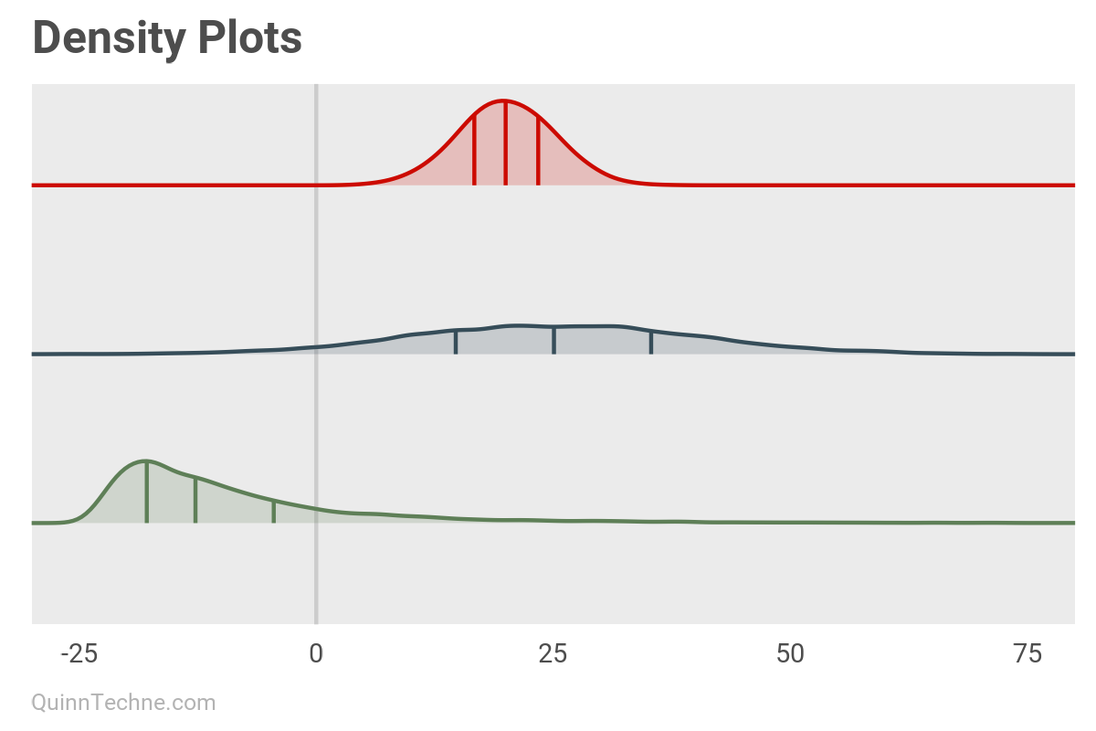
You can mark the same percentiles while also showing the silhouette or profile of the distribution instead of looking top down. These are density plots, and you can overlap them in the same plot using geom_density_ridges() from the package ggridges found here.

The prior examples are focused on the style differences. However, plots in the wild will have titles, subtitles, axis titles, annotations, footnotes, captions, and supporting text. These are great tools for orienting new and expert audiences to your tables and plots and lowering the chances of misunderstanding. I like how The Economist uses these plot elements to design concise data visualizations.
Proud Plots
When navigating decisions under uncertainty, as in navigating uncertain waters, the journey from data to decision requires more than just knowing the average depth. By designing communications and results with distributions in mind, using tables and plots, we can make the decision context more transparent and accessible, thus better result checking and better science by everyone.
Actuarial Standards Board. (2009, December). Actuarial Standard of Practice (ASOP) No. 41 — Actuarial Communications. American Academy of Actuaries. https://www.actuarialstandardsboard.org/wp-content/uploads/2014/03/asop41_secondexposure.pdf
McElreath, R. (2020). Statistical Rethinking: A Bayesian Course with Examples in R and Stan (2nd edition). Chapman and Hall/CRC. https://xcelab.net/rm/
Oreskes, N. (2020, April 14). Why trust science? [Video]. YouTube. https://www.youtube.com/watch?v=OuPSNHje4yg
Pole, A., West, M., & Harrison, J. (1994). Applied Bayesian Forecasting and Time Series Analysis. Chapman and Hall/CRC.
Tables made in R using the gt package: Iannone R, Cheng J, Schloerke B, Hughes E, Lauer A, Seo J, Brevoort K, Roy O (2024).
gt: Easily Create Presentation-Ready Display Tables. R package version 0.11.0. https://CRAN.R-project.org/package=gt
Gabry J, Mahr T (2024). bayesplot: Plotting for Bayesian Models. R package version 1.11.1. https://mc-stan.org/bayesplot/
Qiu Y (2024). showtext: Using Fonts More Easily in R Graphs. R package version 0.9-7. https://CRAN.R-project.org/package=showtext
Wickham H, Averick M, Bryan J, Chang W, McGowan LD, François R, Grolemund G, Hayes A, Henry L, Hester J, Kuhn M, Pedersen TL, Miller E, Bache SM, Müller K, Ooms J, Robinson D, Seidel DP, Spinu V, Takahashi K, Vaughan D, Wilke C, Woo K, Yutani H (2019). Welcome to the tidyverse. Journal of Open Source Software, 4 (43), 1686. https://doi.org/10.21105/joss.01686
Wilke C (2024). ggridges: Ridgeline Plots in 'ggplot2'. R package version 0.5.6. https://CRAN.R-project.org/package=ggridges.
This website reflects the author's personal exploration of ideas and methods. The views expressed are solely their own and may not represent the policies or practices of any affiliated organizations, employers, or clients. Different perspectives, goals, or constraints within teams or organizations can lead to varying appropriate methods. The information provided is for general informational purposes only and should not be construed as legal, actuarial, or professional advice.

